4 months of development, 8 months of polish
After more than one year of development, SimpleMovieX version 3 is finally ready. Software takes a lot of time to make, and if you want a good product, most of the time will be dedicated to what I call polish, or Mac polish to use carpeagua words. Take the Timeline for example. It’s a critical element of user interface that must give clear information that you can understand in a fraction of a second, and also a space for mouse interaction. And it has to be nice looking. You can’t come up with something radical or new, as the user has already worked with other similar applications. You have to ensure “backward compatibility” with what the users bring, what they take for granted.
So, you may ask, why do I persist in using a 2-knobs interface when QuickTime Pro and iMovie use a 3-knobs one?
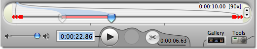

This was one of the first design decision taken, two years ago, and maybe it was taken for a wrong reason: At that time, SimpleMovieX was not doing much, and I couldn’t just copy the QuickTime timeline without trying to “improve” it. So I decided to simplify it by dropping the Playhead knob. After all, when you are editing a movie, what is the point of playing it back if not locating one of the 2 knobs at the playhead? So let merge the 2 functions.
The other reason is that as a developer I use the keyboard a lot to test and use my software, so I tend to optimize the design for me. And driving the 2 knobs interface with the keyboard make SimpleMovieX fly. The power-user that invests a bit of time in learning the 2 knobs interface and the keyboard shortcuts gets a huge reward. But a good user interface is also learnable and with the lowest possible entry cost. I may have turned away a lot of people with my “improvement”.
Still, I can reconsider this choice in a future version of SimpleMovieX. If I switch now to a 3 knobs interface, I take the risk of infuriating the user base that is happy with the current one. I can always make it configurable, with a little switch in the Preferences, but nothing is free: I would probably end up with a fragmented user experience, some actions working better with 2 knobs, other with 3. Divide and conquer is rarely the best option when you’re short on resources like me.
What do you think about my choices?

