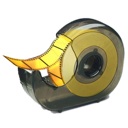
More icon work in progress…
A few days ago, as I was brainstorming ideas for my new icon design, several concepts emerged.
The “Chest”, my preferred one, was featured in the previous post. But a second idea also looked interesting and I decided to develop it as well:

A common problem I find when I write or design stuff, either an user interface, an illustration or an icon, is how difficult it is to judge your own work.
Usually, I let pass a few days before I look at it again. While you’re designing, you’re trying hard to make a certain message emerge out of the drawing, so your perception is biased until you’ve evacuated it completely. You can discover that the design doesn’t work or conveys a different message, but only after a while.
That’s why I’m leaving those two icons in this “almost-done” stage, until my mind cools down and I decide that I like them enough to finish the job.

